

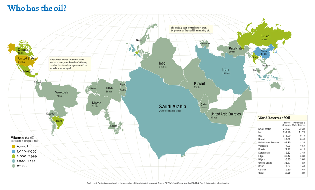
The map above (click here for the large version) shows what the world would look like if each country’s size was proportional to their proven oil reserves. I find it a little surprising that the world’s largest oil consumers (North America, Europe and China) have such a small portion of the world’s oil.
If the presented figures are correct, the U.S. would deplete its entire supply of oil in about 3 years without imports (and could single-handedly deplete the entire world’s reserves in 50 years). Makes you wonder why the U.S. government isn’t more supportive of alternative energy.
Vía. Neatorama tal cual.

1 comment:
aquí huele a azufre!!!!
Post a Comment